CSS Tutorial for Beginners
The language used to style and improve HTML documents is called CSS, or Cascading Style Sheets. We cover important elements to learn for web development through this CSS tutorial.
Introduction to CSS
Changes to fonts, colors, sizes, spacing, column layouts, and animations are possible due to CSS, which specifies how HTML elements are displayed on a webpage.
We will cover the following in this CSS tutorial:
- Overview of CSS
- CSS Selectors
- CSS Styling Techniques
- Embedded CSS
- Responsive Web Design
- CSS Media Queries
Overview of CSS
Websites can be styled and improved using a language called CSS, or Cascading Style Sheets. It regulates how buttons, text, and other HTML elements are shown on a webpage.
- By modifying font sizes and colors, adding backgrounds, and controlling the layout, you may use CSS to make a plain webpage more aesthetically pleasing and easier to use.
- Through the use of external stylesheets included in CSS files, CSS also makes layout control across numerous web pages simpler.
CSS Versions
Released in 1996, CSS1: The foundation provided the fundamental styling features for fonts, colors, and margins.
CSS2: 1998 saw the expansion of CSS2, which gained pseudo-classes, positioning elements, and better layout possibilities.
CSS2.1: 2004 saw more advancements, such as enhanced inheritance and box model characteristics.
CSS3: Released in 2001, CSS3 is a set of modules that add capabilities like web fonts, media queries, and animations. It is not a single version. It is always changing.
Features of CSS
The following are the important features of CSS:
- Improved visual appeal with UX (user experience).
- Responsive design with media queries and Flexbox and Grid.
- SEO advantages for page load speed, structured content, and mobile friendliness.
- Efficient maintenance with modularity and consistency.
- Wide range of career opportunities, such as front-end developer, web designer, and full-stack developer.
Various Applications for CSS
Three methods exist in CSS for styling HTML:
Inline: Use the style attribute to directly add styles to HTML elements (restricted use).
Internal: Insert styles into an HTML file’s <style> tag, commonly in the <head> section.
External: Use the <link> tag to link your HTML file to an independent CSS file with a.css extension.
Example
HTML Code
<!– File name: index.html –>
<!DOCTYPE html>
<html>
<head>
<!– Importing External CSS –>
<link rel=”stylesheet” href=”style.css” />
<!– Using Internal CSS –>
<style>
h2 {
color: green;
}
</style>
</head>
<body>
<!– Using Inline CSS –>
<h2 style=”text-align: center;”>Welcome To SLA</h2>
<p>CSS Tutorial – Softlogic Systems</p>
</body>
</html>
CSS File
/* External CSS */
/* File name: style.css */
p {
text-align: center;
}
CSS Syntax
A property, its value, and a selector form a CSS syntax rule.
- The selector indicates which HTML element the CSS style is to be applied to.
- Each CSS property is separated with a semicolon.
- The selector name is merged with the property:value pair that is defined for that specific selector.
selector { Property: value; }
CSS Selectors
Using CSS selectors, you may apply styles to HTML elements on your pages based on their ID, class, type, attribute, and more. Gaining a deeper comprehension of selectors like the universal selector, attribute selector, pseudo-class selector, and combinator selectors can lead to more efficient and dynamic web design.
Simple Selectors
It is employed to select HTML elements according to their attributes, id, element name, etc. The classes below are contained in simple selectors.
Example
<!DOCTYPE html>
<html lang=”en”>
<head>
<title>CSS Selectors</title>
<link rel=”stylesheet” href=”style.css” />
</head>
<body>
<h1>Sample Heading</h1>
<p>This is Content inside first paragraph</p>
<div id=”div-container”>
This is a div with id div-container
</div>
<p class=”paragraph-class”>
This is a paragraph with class paragraph-class
</p>
</body>
</html>
Element Selector:
It uses the tag names of HTML elements to select them.
Example:
h1 {
color: red;
font-size: 3rem;
}
p {
color: white;
background-color: gray;
}
ID Selector:
It focuses on an HTML element that has a particular ID property.
Example:
#div-container{
color: blue;
background-color: gray;
}
Class Selector:
It identifies elements that possess a specific class attribute.
Example:
.paragraph-class {
color:white;
font-family: monospace;
background-color: purple;
}
Universal Selectors
It selects every element on the page. In CSS, all items within an HTML document can be selected with the Universal selector (*). It also contains additional elements that are included within another element.
Example
* {
color: white;
background-color: black;
}
Group Selectors
To apply the same style to all comma-separated components, use the Group selector.
Example
#div-container, .paragraph-class, h1{
color: white;
background-color: purple;
font-family: monospace;
}
Attribute Selectors
It targets elements according to the values of their attributes.
Example
[href] {
background-color: lightgreen;
color: black;
font-family: monospace;
font-size: 1rem;
}
Pseudo-Class Selector
It uses selectors, like :hover for hover effects, to pick items according to their position or state.
Syntax:
Selector:Pseudo-Class {
Property: Value;
}
Combinator Selectors
These selectors are used to define relationships between elements, like child (>) or descendants ( ).
Pseudo-Element Selector
It picks out particular elements, such ::before or ::after.
Syntax
Selector:Pseudo-Element{
Property:Value;
}
The use of CSS selectors is essential to good web design. By accurately targeting and styling HTML components, these selectors enable developers to produce more visually appealing and dynamic web sites.
The use of selectors such as simple, combinator, pseudo-class, and pseudo-element can greatly improve the appearance and usefulness of your webpages.
CSS Styling Techniques
The presentation of HTML components on a web page is specified by CSS. It enhances your web page, adds animations, and sets the colors and locations of the HTML elements.
CSS Fonts: The text contained in HTML components is styled using CSS fonts. While font-size, font-weight, and font-style regulate the text’s size, thickness, and style, font-family determines the typeface. When these qualities are combined, web content’s typography and readability are improved.
CSS Icons: Because they provide a visual depiction of concepts, actions, and objects, CSS icons are a crucial component of contemporary web design. Scalable and adjustable icons may be smoothly included into your site design with CSS icons, which provide a compelling approach to accomplishing this.
Here’s how to use well-known libraries to integrate and modify icons efficiently:
Font Awesome Icons: One popular icon library that offers a large collection of icons is Font Awesome.
Syntax:
<i class=”fa fa-cloud”></i>
Google Icons: Google Icons are a clean and contemporary icon collection that blends in perfectly with Google’s design language.
Syntax:
<i class=”material-icons”>cloud</i>
Bootstrap Icons: A set of icons created especially for Bootstrap users, Bootstrap Icons improve compatibility and integration for projects using Bootstrap.
Syntax:
<i class=”glyphicon glyphicon-cloud”></i>
CSS Links: A link is an anchor that points to another webpage on the internet. Links can be styled in a variety of ways using the CSS property.
The following lists the four states of the links:
a:link: This is an ordinary, inactive link.
a:visited: The user has clicked on this link at least once.
a:hover: While the mouse is over this, it becomes a link.
a:active: We simply clicked on this link.
Syntax:
a:link {
color:color_name;
}
Embedded CSS
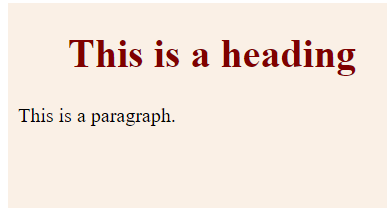
The <style> element can be used to insert CSS rules into an HTML document. Positioned within the <head>…</head> tags is this tag. All of the document’s available elements will be subject to the rules established using this syntax.
Syntax
<!DOCTYPE html>
<html>
<head>
<style type = “text/css” media = “all”>
body {
background-color: linen;
}
h1 {
color: maroon;
margin-left: 40px;
}
</style>
</head>
<body>
<h1>This is a heading</h1>
<p>This is a paragraph.</p>
</body>
</html>
Output
Attributes
Attributes connected to <style> elements are:
type: text/css: It defines the language of the style sheet as a content-type (MIME type). This quality is necessary.
media: It identifies the gadget that will be used to view the document. All is the default value. This characteristic is optional.
Inline CSS
Any HTML element’s style attribute can be used to specify style guidelines. Only that element will be subject to these rules.
Attribute
style: Semicolons (;) are used to separate style declarations, which make up the value of the style attribute.
Syntax:
<html>
<head>
</head>
<body>
<h1 style = “color:#36C;”>
This is inline CSS
</h1>
</body>
</html>
Output

External CSS: The <link> Element
You can incorporate an external stylesheet file in your HTML document by using the element.
An independent text file with the.css extension is an external style sheet. This text file contains all the style rules defined. You can use the element to include this file in any HTML document.
Syntax
<head>
<link type = “text/css” href = “…” media = “…” />
</head>
Attributes
Attributes linked to <style> elements are:
type: text css: it defines the language of the style sheet as a content-type (MIME type). This quality is necessary.
href: URL: It names the style sheet file containing the style guidelines. This quality is necessary.
media: It identifies the gadget that will be used to view the document. All is the default value. This attribute is optional.
Example
h1, h2, h3 {
color: #36C;
font-weight: normal;
letter-spacing: .4em;
margin-bottom: 1em;
text-transform: lowercase;
}
mystyle.css
<head>
<link type = “text/css” href = “mystyle.css” media = ” all” />
</head>
Imported CSS
Similar to the element, @import is used to import an external stylesheet.
Syntax:
<head>
@import “URL”;
</head>
Example
<head>
@import “mystyle.css”;
</head>
CSS Rules Overriding
- Every inline style sheet is of utmost importance. Therefore, it will take precedence over any rules contained in <style>…</style> tags as well as rules found in external style sheet files.
- Rules defined in external style sheet files will be superseded by rules defined in <style>…</style> tags.
- Rules set in this file will only be applied in the event that the first two rules are not applicable. Rules established in the external style sheet file have the lowest priority.
CSS Comments
You may frequently need to add more comments to your style sheet blocks. Therefore, commenting on any portion of the style sheet is really simple. You can easily leave your comments there. /*…..this is a style sheet comment..*/.
Multi-line blocks can be commented using /*….*/, just like in the C and C++ programming languages.
Example
<!DOCTYPE html>
<html>
<head>
<style>
p {
color: red;
/* This is a single-line comment */
text-align: center;
}
/* This is a multi-line comment */
</style>
</head>
<body>
<p>Hello World!</p>
</body>
</html>
Output

Responsive Design
Your website will appear great across all platforms with responsive web design. Simply HTML and CSS are used in responsive web design. A JavaScript script or application is not what responsive web design is.
- Numerous devices, including phones, tablets, and desktop computers, can be used to browse web pages. Regardless of the device, your webpage should be visually appealing and simple to navigate.
- Instead of omitting material to make their pages smaller, websites should modify their content to fit all screen sizes.
Viewport
A web page’s visible region to the user is called the viewport.
- The viewport on a mobile phone is going to be smaller than on a computer screen, depending on the hardware.
- Web pages were often constructed with a static layout and fixed size for computer displays, preceding the emergence of tablets and mobile phones.
Content Sizing for the Viewport
On desktop and mobile devices, users are accustomed to scrolling websites vertically—not horizontally!
Therefore, a bad user experience occurs when the user must zoom out or scroll horizontally to view the entire web page.
Several more guidelines to abide by:
- Avoid using elements with big fixed widths.
- Content should not be dependent on a specific viewport width in order to render properly.
- Use CSS media queries to apply distinct styles for screens that are tiny and large.
CSS Media Queries
A CSS technique called media query was first presented in CSS 3. It includes a block of CSS properties using the @media rule only when a specific condition is met.
Example
@media only screen and (max-width: 600px) {
body {
background-color: lightblue;
}
}
Add a Breakpoint
We created a responsive web page with rows and columns earlier in this lesson, but it didn’t look nice on a small screen.
For such, media inquiries can be useful. To make specific elements of the design act differently on either side of the breakpoint, we can add a breakpoint.
Example
/* For desktop: */
.col-1 {width: 8.33%;}
.col-2 {width: 16.66%;}
.col-3 {width: 25%;}
.col-4 {width: 33.33%;}
.col-5 {width: 41.66%;}
.col-6 {width: 50%;}
.col-7 {width: 58.33%;}
.col-8 {width: 66.66%;}
.col-9 {width: 75%;}
.col-10 {width: 83.33%;}
.col-11 {width: 91.66%;}
.col-12 {width: 100%;}
@media only screen and (max-width: 768px) {
/* For mobile phones: */
[class*=”col-“] {
width: 100%;
}
}
Always Prioritize Mobile Design
Designing for mobile devices should come before designing for desktops or other devices. This will speed up the page’s display on smaller screens.
This implies that our CSS has to be modified in some way.
When the width increases above 768 pixels, we should alter the design rather than updating the styles when the width decreases.
Example
/* For mobile phones: */
[class*=”col-“] {
width: 100%;}
@media only screen and (min-width: 768px) {
/* For desktop: */
.col-1 {width: 8.33%;}
.col-2 {width: 16.66%;}
.col-3 {width: 25%;}
.col-4 {width: 33.33%;}
.col-5 {width: 41.66%;}
.col-6 {width: 50%;}
.col-7 {width: 58.33%;}
.col-8 {width: 66.66%;}
.col-9 {width: 75%;}
.col-10 {width: 83.33%;}
.col-11 {width: 91.66%;}
.col-12 {width: 100%;}
}
Another Breakpoint
Breakpoints can be added to any number you choose. Additionally, a breakpoint between tablets and smartphones will be inserted.
Example
/* For mobile phones: */
[class*=”col-“] {
width: 100%;
}
@media only screen and (min-width: 600px) {
/* For tablets: */
.col-s-1 {width: 8.33%;}
.col-s-2 {width: 16.66%;}
.col-s-3 {width: 25%;}
.col-s-4 {width: 33.33%;}
.col-s-5 {width: 41.66%;}
.col-s-6 {width: 50%;}
.col-s-7 {width: 58.33%;}
.col-s-8 {width: 66.66%;}
.col-s-9 {width: 75%;}
.col-s-10 {width: 83.33%;}
.col-s-11 {width: 91.66%;}
.col-s-12 {width: 100%;}
}
@media only screen and (min-width: 768px) {
/* For desktop: */
.col-1 {width: 8.33%;}
.col-2 {width: 16.66%;}
.col-3 {width: 25%;}
.col-4 {width: 33.33%;}
.col-5 {width: 41.66%;}
.col-6 {width: 50%;}
.col-7 {width: 58.33%;}
.col-8 {width: 66.66%;}
.col-9 {width: 75%;}
.col-10 {width: 83.33%;}
.col-11 {width: 91.66%;}
.col-12 {width: 100%;}
}
Common Breakpoints for Devices
It is challenging to establish a precise breakpoint for every device because there are so many displays and gadgets with varying widths and heights. Five groups could be your focus to keep things simple:
/* Extra small devices (phones, 600px and down) */
@media only screen and (max-width: 600px) {…}
/* Small devices (portrait tablets and large phones, 600px and up) */
@media only screen and (min-width: 600px) {…}
/* Medium devices (landscape tablets, 768px and up) */
@media only screen and (min-width: 768px) {…}
/* Large devices (laptops/desktops, 992px and up) */
@media only screen and (min-width: 992px) {…}
/* Extra large devices (large laptops and desktops, 1200px and up) */
@media only screen and (min-width: 1200px) {…}
Orientation: Landscape/Portrait
Moreover, media queries can be used to modify a page’s layout based on the browser’s orientation.
“Landscape” orientation refers to a set of CSS characteristics that are only applicable when the browser window is wider than its height.
Example
@media only screen and (orientation: landscape) {
body {
background-color: lightblue;
}
}
Hide Elements with Media Query
Hiding components on various screen sizes is another typical application for media queries:
Example
/* If the screen size is 600px wide or less, hide the element */
@media only screen and (max-width: 600px) {
div.example {
display: none;
}
}
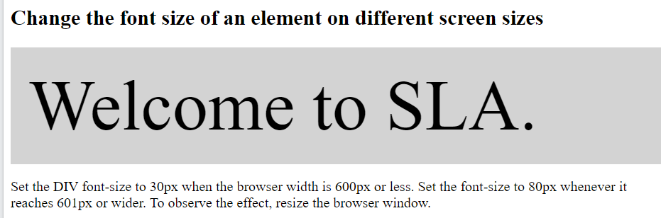
Use Media Queries to Adjust Font Size
Media queries can also be used to alter an element’s text size on various screen sizes.
Example
<!DOCTYPE html>
<html>
<head>
<meta name=”viewport” content=”width=device-width, initial-scale=1″>
<style>
div.example {
background-color: lightgrey;
padding: 20px;
}
@media screen and (min-width: 600px) {
div.example {
font-size: 80px;
}
}
@media screen and (max-width: 600px) {
div.example {
font-size: 30px;
}
}
</style>
</head>
<body>
<h2>Change the font size of an element on different screen sizes</h2>
<div class=”example”>Welcome to SLA.</div>
<p>Set the DIV font-size to 30px when the browser width is 600px or less. Set the font-size to 80px whenever it reaches 601px or wider. To observe the effect, resize the browser window.</p>
</body>
</html>
Conclusion
This CSS tutorial covers everything you need to know to start your web development learning journey. Join SLA for the best CSS training in Chennai.